When procurement teams specify Pantone 286 C for a multi-product drinkware order—expecting that identical color code to produce identical visual results across stainless steel tumblers, ceramic mugs, and powder-coated bottles—they encounter a phenomenon that no amount of file preparation or proof approval diligence can prevent. The same Pantone reference, applied through the same decoration method, produces measurably different visual outcomes depending on the substrate receiving the decoration. This is not a supplier quality control failure. It is a materials physics reality that buyers who consolidate multiple drinkware categories into single-color corporate programs discover only when cartons arrive and side-by-side comparison reveals what specification sheets cannot predict.
The substrate color absorption blind spot emerges from a fundamental misunderstanding about what Pantone codes actually standardize. Pantone Matching System references were developed for coated and uncoated paper substrates—the swatches in a Pantone Formula Guide represent how specific ink formulations appear when printed on standardized paper stock under controlled lighting conditions. When that same color specification is applied to stainless steel, ceramic glaze, powder coating, or glass, the substrate's reflectivity, porosity, surface texture, and chemical composition interact with the decoration medium in ways that shift perceived color by 10-25% compared to the paper swatch. A procurement manager who approves Pantone 286 C based on a paper swatch or digital mockup has not approved the color that will appear on their drinkware—they have approved a reference point that each substrate will interpret differently.
The physics of this variation operates through three primary mechanisms that compound to create the visual inconsistencies buyers observe at delivery. First, substrate reflectivity determines how much light bounces back to the viewer versus how much is absorbed by the surface. Glossy ceramic glazes reflect approximately 60-70% of incident light, creating a luminous appearance that makes colors appear more saturated and vibrant. Matte powder coatings reflect only 15-25% of incident light, with the remainder scattered by surface texture, producing a softer, more muted color perception. The same Pantone 286 C ink formula applied to both surfaces will appear noticeably brighter on glossy ceramic and noticeably darker on matte powder coating—not because the ink differs, but because the light interaction differs. This reflectivity differential alone can account for 8-12% color shift between high-gloss and matte finishes on otherwise identical products.
Second, substrate porosity affects how deeply decoration medium penetrates the surface before curing or drying. Porous substrates like unglazed ceramic or textured powder coatings absorb ink into their surface structure, reducing the concentration of pigment visible at the surface and shifting color toward darker, less saturated tones. Non-porous substrates like polished stainless steel or glazed ceramic keep decoration medium at the surface, preserving pigment concentration and color intensity. The porosity effect is particularly pronounced with UV printing, where ink viscosity and curing speed interact with substrate absorption rates to produce different color densities on different materials. A powder-coated tumbler with micro-textured surface finish may absorb 15-20% more ink than a smooth-glazed ceramic mug, resulting in measurably darker color appearance despite identical ink formulation and application parameters.
Third, substrate base color influences the final perceived color through optical mixing—the phenomenon where the eye blends the decoration color with the underlying surface color to perceive a composite hue. A white ceramic mug provides a neutral base that allows Pantone 286 C to appear as specified in the Pantone Formula Guide. A silver stainless steel tumbler introduces metallic undertones that shift blue toward gray-blue, particularly in areas where UV printing coverage is thin or where the metallic surface shows through translucent ink layers. A black powder-coated bottle requires white underbase printing before applying Pantone 286 C, and any underbase coverage gaps create dark spots that shift overall color perception toward navy or charcoal-blue. The base color effect is most significant on metallic substrates, where even full-coverage printing cannot completely mask the underlying surface reflectivity.
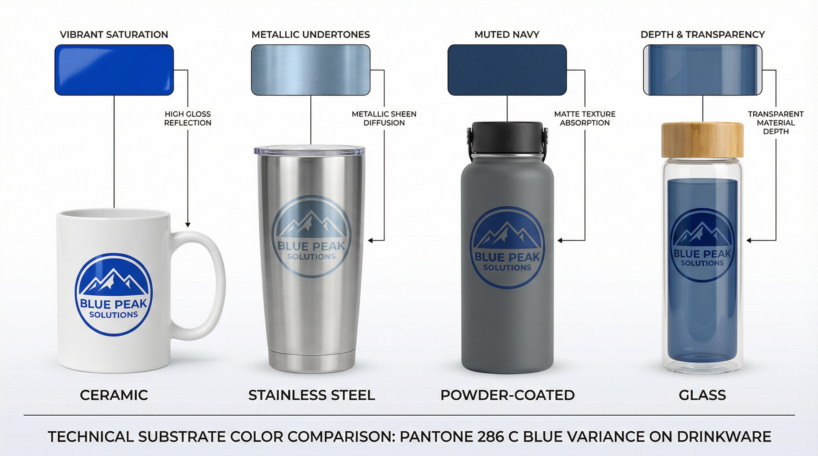
In practice, this creates a scenario where a corporate buyer ordering 500 stainless steel tumblers, 300 ceramic mugs, and 200 powder-coated bottles—all specified as Pantone 286 C—receives three visually distinct blues. The ceramic mugs appear closest to the Pantone swatch, with vibrant, saturated color that matches the brand guideline reference. The stainless steel tumblers appear 10-15% lighter and more metallic, with silver undertones visible through the UV printing that create a sophisticated but noticeably different appearance. The powder-coated bottles appear 15-20% darker and more muted, with the textured surface scattering light and reducing perceived saturation to produce what recipients might describe as "navy" rather than "corporate blue." When these products are displayed together at a corporate event or distributed to employees across departments, the color inconsistency undermines brand cohesion and creates the impression of quality control failure—even though every product was produced exactly to specification.
The misjudgment occurs because buyers treat Pantone codes as absolute color definitions rather than relative reference points that require substrate-specific interpretation. When a brand guideline states "corporate blue is Pantone 286 C," procurement teams interpret this as a universal standard that any supplier can match on any substrate through proper color management. In reality, brand guidelines developed for print applications—business cards, brochures, signage, packaging—do not translate directly to promotional products without substrate-specific adjustment. The same Fortune 500 company that maintains rigorous color consistency across printed materials often distributes drinkware in three different blues because no one recognized that substrate-specific color standards were required. This is not a failure of supplier capability—most drinkware manufacturers can match any color specification provided, and many maintain sophisticated color management systems with spectrophotometer verification. It is a failure of specification completeness, where buyers provide a single Pantone reference without acknowledging that different substrates require different formulations to achieve visual consistency.
The practical consequence extends beyond aesthetic disappointment into measurable financial impact. When a buyer receives 1,000 units across three drinkware categories and discovers unacceptable color variation, the remediation options are limited and expensive. Re-production requires 4-6 weeks and incurs full production costs for replacement units—typically $12,000-18,000 for a 1,000-unit order depending on product mix. Color correction through additional decoration layers, such as adding white underbase to stainless steel UV printing, may not be possible after initial production because the existing decoration would need to be removed or covered. Accepting the variation and distributing mismatched products damages brand perception among recipients, who may interpret the inconsistency as evidence of cheap sourcing or careless procurement. The $15,000-25,000 order becomes a $30,000-40,000 lesson in substrate-specific color management—a cost that could have been avoided through proper specification during the RFQ phase.
The solution requires buyers to abandon the assumption that a single Pantone code produces a single visual result across all substrates. For multi-substrate orders, procurement teams should request physical samples on each substrate before production approval, evaluating samples side-by-side under the lighting conditions where products will be used—office fluorescent lighting for desk accessories, outdoor daylight for event giveaways, retail display lighting for merchandise programs. If visual consistency across substrates is a priority, buyers should work with suppliers to develop substrate-specific color formulations—accepting that Pantone 286 C on ceramic might require Pantone 287 C on powder coating to achieve visual equivalence when products are viewed together. Alternatively, buyers can select decoration methods that minimize substrate influence: laser engraving produces consistent metallic reveal across all stainless steel products regardless of powder coating color, eliminating the color matching variable entirely by creating monochrome decoration that derives its appearance from the substrate rather than from applied pigment.
Understanding how substrates interact with decoration methods is essential for managing expectations in corporate drinkware customization programs. The substrate color absorption blind spot is not a quality defect that suppliers can eliminate through better processes or more sophisticated equipment—it is a materials physics constraint that buyers must accommodate through informed specification. When procurement teams recognize that Pantone codes are starting points rather than guarantees, they can structure orders, approval workflows, and supplier communications to achieve the visual consistency their brand requires.
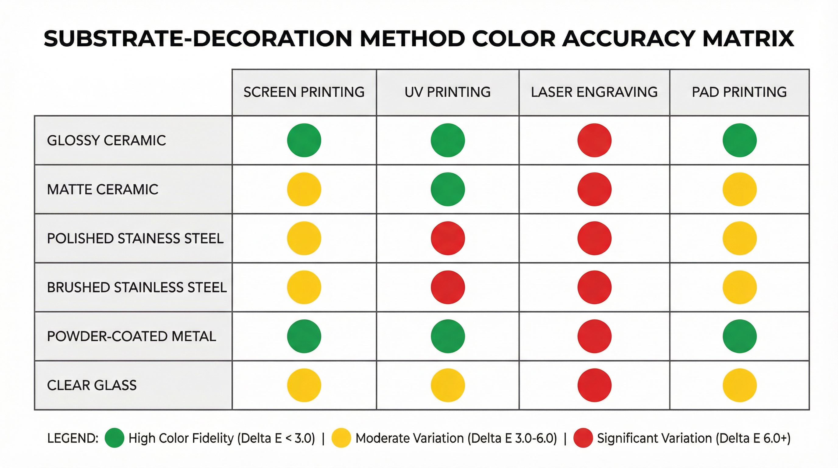
The most experienced corporate buyers approach multi-substrate orders with explicit acknowledgment that color matching is substrate-dependent. They specify acceptable Delta E tolerances—the measurable color difference between samples using CIE Lab color space calculations—rather than expecting pixel-perfect Pantone matching. A Delta E of 1.0 represents the threshold of perceptible difference for trained observers; a Delta E of 3.0 represents noticeable but acceptable variation for most commercial applications; a Delta E of 6.0 or higher represents obvious color mismatch that recipients will notice immediately. By specifying Delta E tolerances rather than absolute Pantone matching, buyers create measurable acceptance criteria that suppliers can verify with spectrophotometer readings before shipping.
Experienced buyers also request production samples from each substrate category before approving full production, recognizing that digital mockups cannot replicate substrate-specific light interaction. They evaluate samples under multiple lighting conditions, acknowledging that metamerism—the phenomenon where colors appear to match under one light source but diverge under another—affects substrate-specific color perception in ways that single-condition evaluation cannot reveal. And they communicate with internal stakeholders about the inherent limitations of cross-substrate color consistency, setting realistic expectations before products arrive rather than managing disappointment after distribution.
The substrate color absorption blind spot represents a category of customization process risk that cannot be eliminated through better file preparation, more careful proof approval, or stricter supplier quality control. It can only be managed through informed specification that acknowledges materials physics realities. Buyers who understand this constraint structure their orders to minimize its impact—either by selecting single-substrate programs where color consistency is achievable, or by accepting controlled variation across substrates where visual equivalence is more important than Pantone precision. The buyers who experience the most significant disappointment are those who assume that specifying Pantone 286 C guarantees Pantone 286 C across all products, discovering only at delivery that their assumption was physically impossible to fulfill.

The diagram above illustrates how identical Pantone 286 C specification produces visually distinct results across four common drinkware substrates. Glossy ceramic (far left) displays the most saturated, vibrant blue due to high surface reflectivity and neutral white base color. Matte stainless steel (second from left) shows metallic undertones and reduced saturation from silver base color influence, creating a sophisticated gray-blue appearance. Textured powder coating (third from left) appears darkest due to light scattering from surface texture and ink absorption into porous coating structure. Clear glass with interior printing (far right) demonstrates how substrate transparency affects color depth perception, with light passing through the decoration layer rather than reflecting from it. All four products were produced to identical Pantone specification using comparable UV printing processes—the variation is inherent to substrate physics, not production quality or supplier capability.

The decision matrix above maps decoration methods against substrate types to indicate expected color accuracy relative to Pantone specification. Green cells indicate high color fidelity (within Delta E 3.0 of specification), where buyers can expect close visual match to Pantone swatches. Yellow cells indicate moderate variation (Delta E 3.0-6.0, noticeable but acceptable for most applications), where buyers should request physical samples before production approval. Red cells indicate significant variation (Delta E 6.0+, requiring substrate-specific color adjustment), where buyers must develop custom color formulations or accept visible deviation from brand guidelines. Buyers can use this matrix to predict which substrate-decoration combinations will require additional color matching effort and which will produce acceptable results from standard Pantone specification.