Branding workflow
The Corporate Buyer’s Artwork Checklist for Curved Drinkware
A procurement-ready drinkware logo artwork checklist for curved tumblers, bottles, and mugs: files, color, placement, proofing, and release controls.
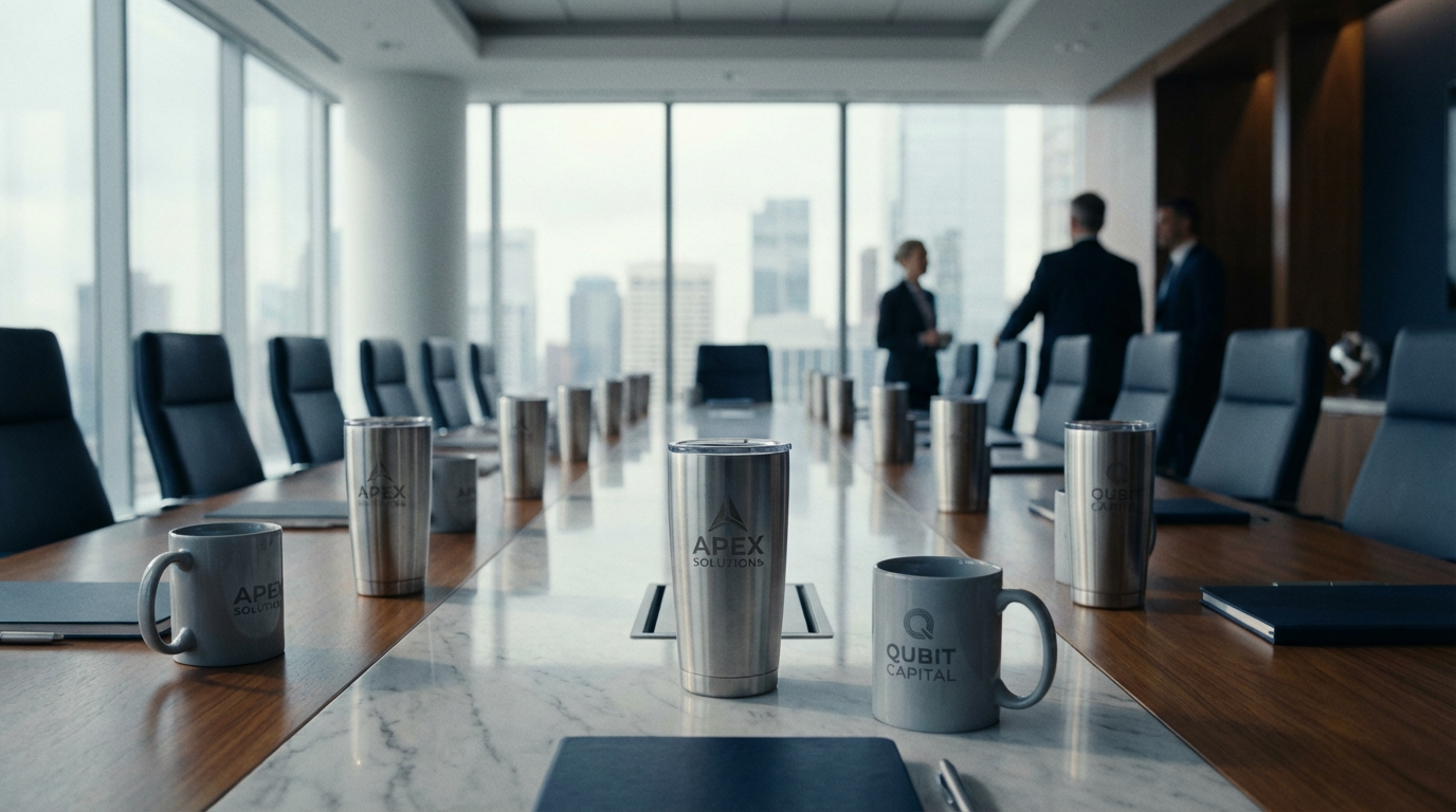
A production-ready drinkware logo artwork checklist should confirm the vector file, outlined type, color reference, decoration method, curved-surface placement, imprint limits, and named proof approver. Treat the artwork as a manufacturing specification, not a marketing attachment: the approved file, physical sample, and written tolerances must all describe the same finished item.
Why curved drinkware needs a procurement checklist
A tumbler, bottle, or mug is not a flat sign. Its diameter changes around the circumference, and a tapered body may change diameter from base to rim. Artwork that looks centered in a flat PDF can appear rotated, pinched, or visually low after it is wrapped around the vessel. An unclear file or unrecorded placement can create a revision loop before release.
A useful checklist separates three questions. First, can the file be used by prepress or the decoration operator? Second, will the chosen method reproduce the intended logo on this finish and geometry? Third, has the right person approved the exact proof that production will repeat? If any answer is “not yet,” the purchase order is not artwork-ready.
This is the same screen-versus-production distinction covered in the production-ready artwork file guide. Convert brand intent into a controlled input that a supplier can inspect and reproduce.
Checklist 1: lock the source file
Request the original brand asset from marketing, the design agency, or the brand-asset owner. Prefer an editable AI, EPS, or vector PDF. Adobe explains that vector artwork uses mathematical paths and can be scaled without the quality loss associated with pixel-based raster images; it also identifies SVG, EPS, and AI as common vector formats (Adobe’s raster-versus-vector explanation).
Do not treat a filename as proof. A PDF can contain vector paths or an embedded image. A file called “logo-final.ai” can also contain a placed JPEG. Ask the artwork owner to confirm that the logo mark, text, and fine rules are editable paths rather than a screenshot or flattened image.
Use this file-control checklist before sending an RFQ:
- Confirm the logo revision, owner, and date.
- Keep a master file unchanged; make a production copy for conversion and scaling.
- Convert fonts to outlines, or include the exact font license and file if live type is required.
- Remove hidden layers, stray marks, unused color swatches, and clipping masks that could export unexpectedly.
- Include a transparent, one-color version for engraving or limited-color decoration.
- Include a full-color version only when the proposed process supports it.
- Name the file with the brand, SKU or project, artwork revision, and color version.
A PNG or JPEG may be acceptable for some continuous-tone processes if its effective resolution is adequate at the final imprint size. It is not a substitute for a vector master when the logo contains text, line art, or shapes that must remain crisp. Never “vectorize” a file by changing its extension.
Checklist 2: define the logo before defining the decoration
The decoration method is a production decision, not a last-minute preference. Ask the supplier which process is being quoted and what that process can reliably reproduce on the specific body, coating, and curvature. Laser engraving is generally a single-tone result based on the exposed substrate; a screen or pad process may suit a limited-color mark; a digital process may handle more complex artwork. The supplier should confirm the method rather than the buyer assuming that every file can use every process.
Record the following against the artwork revision:
| Decision field | Buyer specification to record | Why it matters on a curve |
|---|---|---|
| Decoration method | Engraving, screen, pad, UV, or supplier-confirmed alternative | Determines paths, separations, registration, and color limits |
| Imprint faces | One side, two sides, or wrap | Changes orientation, seam, and viewing logic |
| Finished size | Width and height in inches or millimeters | Controls legibility and relationship to the body |
| Position | Reference from base, rim, handle, seam, or molded feature | “Centered” is not reproducible without a datum |
| Color instruction | Named spot reference, process values, or single-tone result | Screen appearance is not a reliable production standard |
| Approval object | Digital proof, decorated sample, or both | Establishes what the approver actually accepted |
Do not specify a generic “maximum imprint area” as if it were a target. Maximum and recommended areas can differ because of taper, handle clearance, lid geometry, grip zones, and the method’s registration tolerance. Request the supplier’s template for the exact SKU, then place the artwork inside that template without editing the product outline unless the supplier asks for a change.
Checklist 3: account for curved-surface geometry
For a cylindrical body, a horizontal logo may look compressed at the sides as the surface turns away from the viewer. On a tapered body, a rectangular artwork panel may not map evenly around the circumference. The supplier or decorator should own any technical distortion or wrap compensation. The buyer approves the visual intent and result.
Write the placement in measurable terms. For example: “front mark, visual center aligned to the opposite handle axis, lower edge 38 mm above the base, artwork width 62 mm, no text within the lid seam zone.” This is stronger than “front and centered.” If the product has a seam, weld, handle, raised ridge, or grip panel, identify it in the proof.
The related guide on corporate logo placement for curved surfaces is useful for the brand team, but procurement should translate its visual direction into the measurable fields above. A supplier cannot inspect “premium placement” as a pass/fail criterion; it can inspect dimensions, references, orientation, and an approved physical sample.
Checklist 4: control color and contrast
A brand color should have a defined reference and a defined expectation. “Match our blue” is incomplete because the body finish, ink, lighting, and process affect the observed result. If the mark uses a spot color, name the applicable Pantone reference and suffix where relevant. Pantone distinguishes spot color, made from a premixed ink, from process color, commonly built from cyan, magenta, yellow, and black; it also notes that some spot colors cannot be simulated exactly in CMYK (Pantone’s spot-versus-process guide).
Your artwork brief should state:
- The color standard or values supplied by the brand owner.
- Whether the proof is a visual approval or an instrument-based match.
- The body color, coating, gloss or texture, and any underbase requirement.
- The minimum contrast expectation for small text and reverse-out marks.
- Whether the supplier may substitute a visually close color if the named process cannot reproduce it.
Do not promise an exact color match without defining the substrate, lighting, measurement method, and tolerance. A monitor rendering is a communication aid. It is not the production standard. If color is business-critical, request a decorated sample on the actual finish and approve it under agreed lighting. Keep the approved sample or controlled photographs with the purchase specification.
Checklist 5: make small details manufacturable
A logo can be technically vector and still be unsuitable at the intended size. Fine rules, counters in letters, tight gaps, small legal lines, and reversed text can fill in or disappear after decoration. Minimum line weight is process- and size-dependent, so do not invent a universal threshold. Ask the supplier for the method-specific minimum and have the operator flag any feature below it.
Use a simple preflight review:
- View the mark at its actual finished size, not only at 400% zoom.
- Check positive and reverse versions on the proposed body color.
- Inspect the smallest text and enclosed counters.
- Confirm that strokes are expanded or otherwise handled as the process requires.
- Remove details that do not survive the use case rather than hoping the factory will interpret them.
- Keep a simplified one-color fallback approved in advance if the full mark fails the method review.
The approval workflow that prevents rework
Use one controlled workflow from intake to release:
- Intake: Procurement collects the SKU, quantity, event or in-hand date, decoration request, artwork owner, and approver names.
- Preflight: The supplier checks file structure, paths, color, dimensions, and process suitability against the exact product template.
- Technical questions: The supplier returns a marked-up proof with any distortion, line-weight, seam, or contrast issue clearly identified.
- Digital proof: The buyer reviews size, orientation, position, colors, and copy. Digital approval authorizes the intended layout; it does not prove physical adhesion, tactile finish, or color on the actual body.
- Decorated sample: When the brand risk or order importance warrants it, approve a decorated sample made with the proposed method and finish.
- Release record: Store the signed proof, artwork file, sample photographs, product identity, tolerances, and revision number together.
- Production inspection: Compare the finished lot with the approved reference and escalate any unapproved substitution or artwork deviation.
The custom drinkware sample approval checklist explains why a digital mockup and a physical sample answer different questions. That distinction is especially important for curved vessels, where the screen cannot show every effect of grip, taper, seam, or coating.
A practical approval calculation
Suppose a buyer wants a logo with a 72 mm nominal width on a bottle whose quoted template permits 80 mm. The buyer also wants 4 mm of clearance on each side from the template boundary. The usable target width is:
80 mm − 4 mm − 4 mm = 72 mm
That arithmetic confirms only the horizontal fit. It does not confirm legibility, taper, seam clearance, or the logo’s visual center. If the preflight review finds that the smallest reversed text is below the process minimum, the correct next step is not to approve because the width fits. The buyer should remove or enlarge that detail, select a different method, or approve a simplified mark. Record the revised width and reason so a later reorder does not revert to the failed artwork.
For a program with multiple SKUs, repeat the same check per SKU. A logo that fits a straight bottle may not fit a conical tumbler at the same nominal width. Do not assume that one approved mockup transfers across models.
Release checklist for the purchase order
Before authorizing production, the buyer should be able to answer “yes” to every applicable item:
- Is the artwork revision named and traceable to the brand owner?
- Is the file genuinely vector where the method requires paths?
- Are fonts outlined and the production copy free of hidden or stray elements?
- Is the exact SKU, finish, body color, and decoration method identified?
- Are imprint dimensions and reference points written down?
- Are taper, seam, handle, lid, and wrap start/end conditions shown?
- Is the color standard and approval method defined?
- Has the smallest detail passed method-specific preflight?
- Is the proof approver named, with authority to release the order?
- Are any supplier changes recorded as deviations rather than accepted informally?
- Are the approved proof and, when required, decorated sample photographs attached to the order record?
For stainless steel tumblers and water bottles, DrinkwareWorks USA’s existing program facts are a 50-unit MOQ and 2–4 week production after approved artwork. Ceramic mugs carry a 100-unit MOQ and 3–5 week production after approved artwork. These are production windows after approval, not a promise that an unresolved artwork file will enter the queue. Artwork readiness should therefore be established before the commercial timeline is treated as usable.
Frequently asked questions
Can a PNG be used for a curved tumbler?
Sometimes, if the selected process accepts raster artwork and the file has sufficient effective resolution at the finished size. A PNG does not prove production readiness. For logos and text, provide a vector master and ask the supplier to confirm the method-specific requirement.
Should procurement distort the logo for a tapered bottle?
No. Procurement should specify the visual placement and approve the supplier’s technical adjustment. The decorator should control the production template or distortion method so the change remains tied to the exact SKU.
Is a digital proof enough?
It confirms intended layout, size, position, and stated color direction. It cannot by itself confirm physical color, adhesion, tactile finish, or how the mark reads around a curve. Use a decorated sample when those risks matter to the program.
What does “Pantone match” mean on drinkware?
It means the buyer has named a color reference, not that every surface will look identical under every light. Specify the substrate, finish, process, sample-approval method, and any agreed tolerance.
Who should sign off the artwork?
The brand owner should approve identity, color, and visual presentation. Procurement should approve the commercial scope and revision record. The supplier’s prepress or production contact should confirm technical manufacturability. One named person should hold the final release authority.
Next step
Send the supplier the exact SKU, quantity, intended decoration, production-ready logo files, color references, and named approver in one package. If any of those inputs are still conditional, document the open decision before requesting a final production window through DrinkwareWorks USA’s contact page.
Sources